|
Item:
Star Trek Enterprise-D
Released:
June 2009 Starship Legends Line by DST
The
Enterprise D has always had a unique look to it. I’ve
always thought that it is a very strange look for a starship
being that it is so bulky and oddly shaped. When I think of
aerial and space ship design, I automatically think of
something very sleek and fast, something simple and tubular,
or something proportional. The Enterprise D doesn’t really
fit any of these classifications but somehow it still
works. The huge elliptical saucer section connected to the
flatter engine section has become an iconic image that is
almost as well known as the original Enterprise. When DST
announced the creation of a new Enterprise D, I was very
excited but I knew they had large shoes to fill. The
Playmates Enterprise-D was always one of my favorite toys
growing up and it truly was a great ship. I think I wore
out the photon torpedo button from firing at one too many
Klingon ships. I was further encouraged when I saw the
prototype at Wizard World Chicago in the summer of 2008 and
even more excited when we got some more details through the
Art Asylum blog when they released the design specs on it.
So lets get right into the review.
The packaging
utilizes the new standard packaging style instituted for the
Trek XI release. The package’s front displays the ship
nicely with a cut out section in the same shape of the
Enterprise to show off the top of the ship. A
quintessential Jean-Luc picture is prominently featured at
the bottom just to make sure everyone knows who’s ship this
is. Then of course opposite of Picard is an older photo of
the Enterprise taken from the series. It’s a very simple
design but very effective. My only complaint is that the
ship is held into the packaging by some massive twist ties
but I guess they are absolutely necessary considering the
ability of this ship to separate and DST definitely did not
want it to do that during shipping. The font of the ship
also has a “try me” button that makes the ship light up and
says a single phrase. The sides of the box show off some
more shots of the Enterprise from stock photos and also list
the features that the ship has. The back of the package
features some architectural drawings of the ship and also a
brief description of the birth of Trek and TNG. The coolest
part of the description is the technical specs about the
size of the ship, decks, and crew complement. Then of
course we have some advertising for other DST products. The
real sad part about the advertising is that only two items
from the 24th century are pictured: Minimate
Picard and a Minimate Borg. I really wish we could have
some other 24th century stuff to complement this
ship. Overall I like the colors of the packaging. I think
the shades of blue really accentuate the ship itself. I
would have to say that I like this packaging a lot more than
the TOS Enterprise release because of the brighter color
scheme. The most important part is the box shows off the
ship well and the “try me” button really gives the buyer o
good feel for what to expect when opened.
From here
on, I’m going to divide the review up into a few
categories. They include sculpt, paint application, action
features and pose-ability for lack of a better term.
When I saw
the first pictures of the ship online, I was truly amazed at
how detailed the sculpt is. When I first picked it up the
sculpt becomes even better. The level of detail put into
this ship goes far beyond any other ship released to date.
Every single line is sculpted onto the hull. Actually the
level of detail is so much that it causes some issues with
the rest of the paint applications. I especially like the
care that was taken to hide any extra marking such as
warnings and copyright stamps. All of those were covered up
by battery compartments that concealed all the necessary
markings that usually disrupt the overall sculpt of the
ship. In addition to that DST took extra steps to conceal
screw holes and stand holes. Provided with this ship were
plugs to fill in the multiple stand holes that were needed
because of the ability to display the ship both connected
and in separation mode. This was a small detail that could
have easily been skipped but it adds so much to the overall
presentation. On top of all that, care was also given to
making sure that screw holes were also invisible. This ship
require two battery compartments because of the separation
and DST used an extra sliding cover on the top of the saucer
to make sure that the extra compartment did not disturb the
sculpt. When I first picked up the ship I didn’t even
realize there was a compartment there! It was only after
reading the instructions that I realized that there were two
battery compartments on the ship. I also really enjoyed the
warp field grille specifically the clear pieces used for the
light up feature. The color of translucent plastic used for
the warp field grille is almost the perfect color of
blue-grey for when the ship is stationary. On the other
hand the red of the bussard collectors is really vibrant and
really gives some much needed color variety to the overall
presentation. I was also impressed by the amount of details
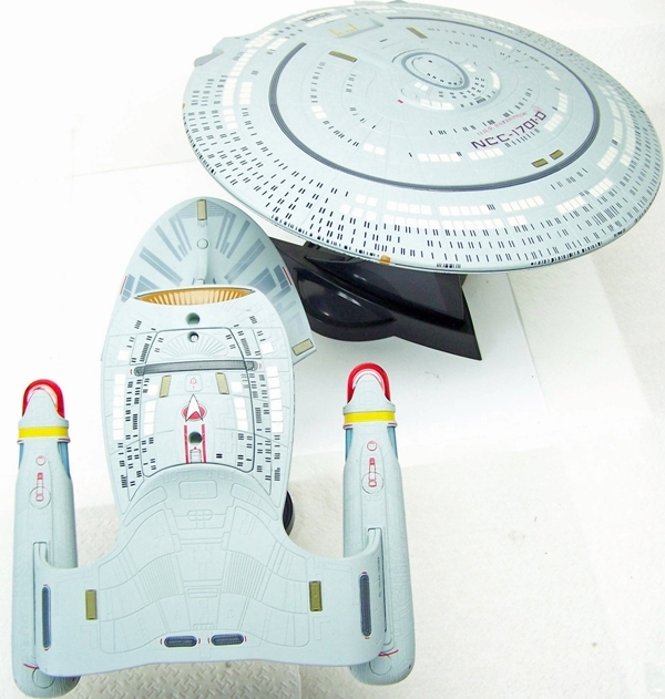
sculpted into the battle bridge section of the ship. Even
though this part of the ship is only visible when separated,
DST did not go cheap and just leave it alone. Every single
detail is sculpted onto the hull. I really can’t sing the
praises of this sculpt any more so I will leave it there and
let you marvel at it with the pictures and hopefully in your
own hands.
I wish I could say
that the paint applications were as strong as the sculpt but
unfortunately I cannot. Whereas the sculpt of this ship is
truly its best feature, the paint apps are truly its
downfall. My biggest complaint is that the windows are not
sculpted into the mold. This is really where the Playmates
version and DST version has the biggest divergence. On the
Playmates version, the windows are sculpted into the hull
but it does not have the minute detail lines that the DST
version has. On the flipside, the DST version has the
minute details sculpted but not the windows. In a perfect
world I would love to have both sculpted on but I don’t know
how many problems that would create with overlapping. The
DST ship simply painted the windows on and it creates the
most noticeable points of mistake on the ship. Many of the
clusters of the windows are painted too closely together and
it causes them to run together, others are jagged (sometimes
because of all the detail they are being painted over), and
many are just smudged due to the minute nature of the window
itself. The biggest areas of concern on my ship are on the
bottom of the saucer on the inside ring, the top of the neck
connector, and on the bottom of the engineering section off
of the battery compartment. All of these issues aren’t
noticeable from a distance but when you get up close to the
ship mine become very visible. I’m not really sure if
sculpting the windows would have helped the problem given
how small the windows are but I think it would have been a
better option for the overall presentation of the ship. The
second biggest problem that I’ve seen is the lack of painted
windows on the neck of the ship. The stripes that are
painted there are completely correct and belong there. It
would have been nice to get the few strips of windows though
and it’s a bit puzzling because they are there on the AGT
version. Here is where they could have used sculpted
windows as well because the neck area is very smooth in
comparison to the rest of the hull and the change in texture
is noticeable.
I also wish this
were the end of the problems but they are not. There are
numerous other problems with the paints over the whole
ship. The biggest issue is a very big smudge on the top of
the saucer next to the letter D. It’s pretty significant
and is a horrible place for there to be a smudge because
that is really a focal point of the ship. In addition to
that some of the wording on the underside of the saucer and
other areas is a bit distorted due to the huge amount of
detail sculpted in. I guess when you have such a great job
done in one area, sacrifices must be made in others. Other
smudges appear on the impulse engines and on some of the
maneuvering thrusters. The only other negative I can find
are the missing aft photon launchers on the back of the
engineering section. I can sit here and nitpick until I’m
blue in the face, but there is a lot of pretty intricate
detailing that was done perfectly. The best example is the
Enterprise name being printed on the back of the warp
nacelles in one of the smallest fonts I’ve ever seen used.
I’m not even sure if my printer could have done that! In
addition to that, all of the escape pods are painted
perfectly and even though some are smudged or crooked,
having that many windows painted on is a pretty impressive
feat. I also impressed by the paint apps applied to the
areas of separation both o the engineering section and the
saucer section. These again are areas that could have
easily been neglected, but DST took the time to put in the
added detail.
The action features
of this ship really make up for a lot of the negatives. The
coolest feature is the saucer separation. This is the first
time that we are getting this feature on a toy and DST did
it up to perfection. As noted before, both pieces are fully
sculpted and painted through and through. The magnets
holding the two pieces together are surprising strong. I
even put the engineering section on my refrigerator and it
stuck! By far the coolest part of this feature is the
lights/sound that accompanies the pulling apart of the two
parts. When pulled apart the phase “Prepare for emergency
saucer sep” plays followed by the separation sound effect
and flashing lights. Even cooler is when they are put back
together another sound effect plays with the flashing lights
again. The second coolest feature is the constant running
button that keeps the lights running. For those of you that
like to display this on a desk/mantle, this is an awesome
feature that is a first for DST or Playmates. Finally there
are just a ton of phrases and sound effects that come with
pushing the dome button. You can also have the system cycle
through them all by holding the button for 5 seconds. The
sounds are a bit soft in my opinion but I haven’t yet
changed the batteries to see if that makes a huge
difference. I would have also liked to have separate
buttons for certain sounds like the photons and the phasers
but so far that just isn’t DST’s cup of earl grey. On the
other hand, the LED lights are extremely powerful. The
blues and reds really give this ship some extra pop when
sitting on a shelf with the lights running. I know DST
posted a schematic of all the LEDS they used in this ship
and let me say they are all well worth it. Im especially
impressed with the warp nacelles and the red and the blue
not overlapping and mixing together where the bussard
collectors meet the warp grille. I though for sure we would
get some purple in there but DST did a good job making sure
the two didn’t bleed together. Unfortunately, there are
issues with light bleed in the areas closest to the LED.
The warp nacelles have 3 visible spots all corresponding to
where the LED is located. The deflector dish and impulse
engines both have areas where the paint wasn’t sprayed on
correctly and light shines through. Overall, it’s a fairly
good job stopping the light bleed but a little extra could
have stopped it completely.
The last thing I
want to look at is the stand for the ship. DST did a duel
stand that fit within each other. They used a new style of
stand that is similar to the one used by playmates for the
Ent-XI. However this one is black and has the TNG delta
pattern as the base. Let me first say that this ship is
extremely heavy and the weird shape doesn’t allow it to
balance well. The center hole used for standing the ship in
one piece basically only works when posing in one direction
because any other pose cause the center of weight to shift
and the ship falls. I think the stand’s new construction is
a bit more sturdy but I could see it having the same
breakage problems as previous releases. Im not completely
sure but that is just my feeling. I had absolutely no
problems displaying the two pieces separately. I think
overall it’s a pretty cool idea and it gives collectors an
extra option when they are looking for ways to show off this
ship.
Also make sure you
read the included instructions because there are a lot of
little details about how to turn on certain features such as
the saucer separation sounds and running lights!
Overall, I would
highly recommend this ship. First it has an excellent
sculpt that really makes the ship look special. Secondly,
the action features are just too cool to pass up. The
saucer separation is one of the coolest things I’ve seen on
a toy in a while and it was expertly done. I would suggest
though (if possible) to see the ship you are buying before
you buy. The smudge on the top of my ship is really
noticeable and detracts a lot from the overall
presentation. I’m probably going to customize this one and
buy another one to display. Everything else negative though
is greatly made up for by all the positives. I would say
hands down this is the best ship DST has produced thus far
and every Star Trek fan should own one!
Positives:
Impressive overall
sculpt
Sturdy display stand
Detailed paint apps
Bright LEDs
Running lights
feature
Saucer Separation
Cycle sounds feature
Negatives:
Paint job is
sometimes smudged
No windows on neck
Some light bleed
Sounds can only
cycle and are a bit soft
Rating:
 out of 5 stars.
As Always

|