Okay so you all know I am working on the New Force Reference Site, and Rick and I discussed updating the main page as well. I wanted to see what the people here thought about what I was working up. These are only test sites, and things might change if we move forward with this project. And then again we might not do anything to the main page at all....but I just wanted some thoughts.
A few of the links work like the Contact Us, FAQ, and About Us links.
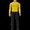
Star Trek Main Page
Art Asylum Main Page
Star Wars Main Page
POSSIBLE layout for figure pages....might be a little different though.
Mirror McCoy Figure Page

Thoughts and Comments....
Started by BadBunnyMike, May 31 2009 05:24 PM
5 replies to this topic
#1

BadBunnyMike
-
- Members
-

- 2,233 posts
Wishes He had Spots
- Gender:Male
- Location:Stockton, California
Posted 31 May 2009 - 05:24 PM
#2
TheHSBR
-

- Global Moderators
-

- 3,621 posts
Mirror Universe Moderator
- Gender:Male
- Location:Chicago, IL
- Interests:This will be quite the list...Star Trek, Star Wars, wrestling, He-Man, comic books, GI Joe, video games, and most of all collecting action figures!
Posted 01 June 2009 - 08:19 AM
I like it!
#3
Tiberius
-
- Members
-

- 817 posts
New Forceaholic
- Gender:Male
- Location:Calgary Canada
Posted 01 June 2009 - 08:17 PM
It looks great, the graphics are phenomenal. I just hope you don't make it too busy that it becomes a chore to navigate.
Can't wait to see it in action...
Can't wait to see it in action...
#4
BadBunnyMike
-
- Members
-
- 2,233 posts
Wishes He had Spots
- Gender:Male
- Location:Stockton, California
Posted 02 June 2009 - 05:02 AM
It wouldn't be too busy.... I promise you that. The few links I've posted would be the general idea of the layout. Like It would be sectioned off better, and a little more user friendly. And thanks for the comment about the Graphics...I went through a few different incarnations before coming up with that. Before I had solid colors and Rick mentioned that most of NFC's Buisness was with Space toys, and that he would want a Space theme, so I manually hand drew the Nebula background with Photoshop and found a picture of Earth to make the Sign In image. I was thinking about making a few different images and every so often changing the color of the "nebula" and changing the planet picture so that the site would be new and exciting every so often.....that thought is still running through my mind....it might happen. Ya never know.
#5
reverie
-

- Members
-

- 1,321 posts
Dances with Toys
- Gender:Male
- Location:Michigan
Posted 02 June 2009 - 06:10 AM
I agree on the busy factor.. what he has now borders on the difficult to navigate, and hard to find what you want, end of things. I like the idea for one page for a figure instead of a listing for a single figure, a listing for two of them, a listing for a case, etc.
Nice work so far!
(also, not on your end I'm sure, but it'd be nice if shipping costs were made a little more clear )
)
Nice work so far!
(also, not on your end I'm sure, but it'd be nice if shipping costs were made a little more clear
)
#6
BadBunnyMike
-
- Members
-
- 2,233 posts
Wishes He had Spots
- Gender:Male
- Location:Stockton, California
Posted 02 June 2009 - 03:12 PM
QUOTE (reverie @ Jun 2 2009, 05:10 AM) <{POST_SNAPBACK}>
I agree on the busy factor.. what he has now borders on the difficult to navigate, and hard to find what you want, end of things. I like the idea for one page for a figure instead of a listing for a single figure, a listing for two of them, a listing for a case, etc.
Nice work so far!
(also, not on your end I'm sure, but it'd be nice if shipping costs were made a little more clear )
Nice work so far!
(also, not on your end I'm sure, but it'd be nice if shipping costs were made a little more clear
)I can make it so that shipping costs are more clear, I can post them on the pages. But if you're ordering a bunch of stuff then combined shipping is something you can't really set a flat rate for.


0 user(s) are reading this topic
0 members, 0 guests, 0 anonymous users

